Wednesday, September 24, 2014

Vocab and Such

Here are various art terms, vocab, and examples that will help you to better understand and communicate during critiques and discussions.
_________________________________________

Balance- A stable arrangement of subjects within a composition.

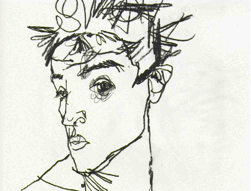
Blind Contour- A blind contour is a drawing where you draw the contours of your subject without looking down at your paper. They very often resemble grotesque versions of the actual subject. 


Composition- Refers to the organization, arrangement, and combination of objects within the borders of a drawing space. Many "rules" define a good composition, but these rules are only guidelines. Your personal preferences and natural instincts are also important. 

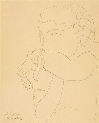
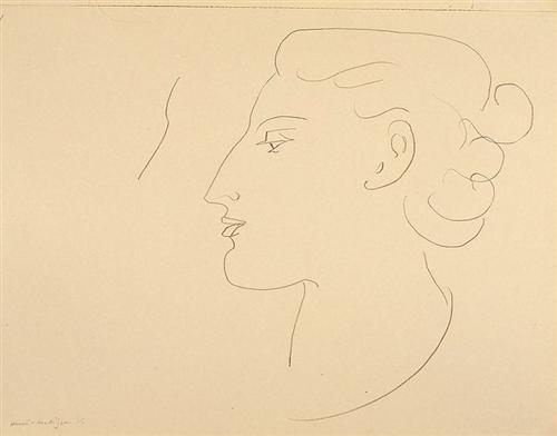
Contour- Similar to a blind contour in the fact that you draw the contours of your subject, however you are 'permitted' to occasionally look down at your paper. Contour drawings tend to look more 'normal' compared to their blind counterpart.
The Floor Scrapers Study by Gustave Caillebotte

Studies for William Rush by Thomas Eakins

Contrast- Extremes of light and dark values that create shapes and patterns in your composition. In the first example below, the figure being in high contrast with the background helps her to stand out to the viewer, and in the second example, the high contrast of light and dark helps to imply dramatic lighting. 
General German Poster Exhibition for Trade Industry and Agriculture by Alphonse Mucha
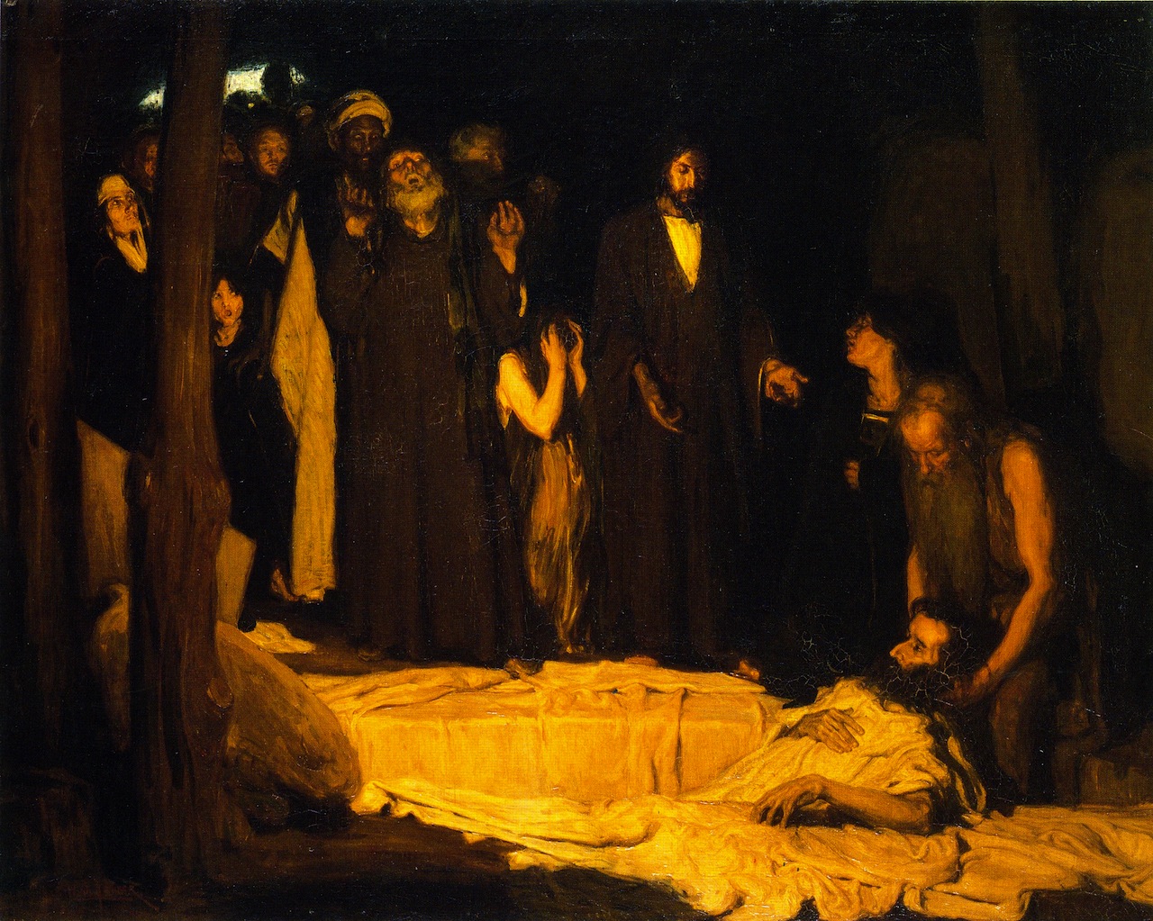
The Ressurection of Lazuras by Henry Ossawa Tanner

Cross hatching- Cross hatching is a technique to add value to a piece using angled lines. The closer and more over lapped the lines are, the darker the area will be--and vice versa.


Focal Point-
A primary center of interest (or focus) in a drawing. 

Hatching-
Is a technique used to create tonal or shading effects by drawing closely spaced parallel lines. Hatching is especially important in essentially linear media, such as drawing, and many forms of printmaking

Femme de Dos (négresse) by George Seurat

Lines:
Navigation tools used to guide the viewer through the different elements of a drawing. 
  • Actual- bold black lines, may vary greatly in weight, character, and other qualities.
  • Implied- Are created by positioning a series of points so that the eye tends to automatically connect them. In a representational drawing, leading lines are usually implied, rather than actual. For example, in a realistic landscape drawing, a leading line can be a pathway, a river, a row of trees, or a fence. When properly rendered, the eye follows this line (or lines) directly into and through the drawing. Another example of emplied lines are lines of sight, or when you can tell what direction a person is looking based off of where their eyes are. 
  • Various types of lines put diverse emotions and moods in your  compositions. Remain conscious of the following effects lines can have in your drawings:

    • Curved lines reflect beauty, gentleness, and calmness. The s-curve denotes balance and grace.
    • Horizontal lines create stability, peace, and serenity.
    • Vertical lines reflect strength, grandeur, and dignity.
    • Diagonal lines offer a sense of movement and power. When diagonal lines meet to form an arrow, they can direct the viewer's eye. 


Negative Space- The space within your drawing not occupied by a focal point, important subject, or area of interest. In the below example, the space in the upper left hand corner is considered negative space. 
Booker T Washington by Henry Ossawa Tanner 

Overlapping- The visual separation of a drawing into foreground, middle ground, and distant space by overlapping (or layering) objects. Overlapping is very important when establishing depth of a composition.
The Gross Clinic by Thomas Eakins


Outline- A basic outline of your subject. Unlike gestures in that you do not get the sense that you are looking at a three dimensional object.

Proportion- The amount of space allocated to the various components of a drawing. In the below example, the proportions of the figures and their clothing is greatly exaggerated in the artists style. 
After the Arnolfini van Eyck by Fernando Botero
Texture- Texture can refer to the actual texture of the paper or support you're drawing on, or an 'implied' texture created from your pencil or pen.
The Starry Night by Vincent van Gogh 
Drawing  Definition:

In a narrow definition of the term, a drawing is an artwork created from lines or areas of tone created with a dry medium on a piece of paper. For example, graphite pencil, charcoal, colored pencil, pigment and dirt.

In a broader definition of the term, a drawing is a two-dimensional artwork created from lines or tone that is dominated by a dry medium but can include wet mediums such as ink,  paint. , dyes.

Drawing can also be a verb, the action of creating such an artwork.

The First Thing You Should Learn to Draw:


A lot of examples used on the blog can be found at http://www.wikiart.org

The Golden Mean-Lecture 5


The Rule of Thirds is an artistic guideline to help keep your composition engaging and interesting. Below are some examples of famous artwork with the rule of thirds overlaid on top of them as well as a few videos to help further explain the concept.


In The Adoration of the Magi you can see that the majority of the figures heads as well as the horizon line falls on one of the guidelines. This helps to guide the viewers to the focal point of the madonna and child. 
The Adoration of the Magi by Raphael


In The Last Supper below you can see that the table top lines up with the bottom guideline, and overall is a very balanced piece with the center figure of Christ being the focal point. 
The Last Supper by Leonardo da Vinci


A pieces composition doesn't have to rely on lining up everything with the guidelines. In The Mona Lisa below, notice that the background and negative space of the figure has an almost symmetrical effect that works on balancing out the slight asymmetry of the figure. 
The Mona Lisa by Leonardo da Vinci


Hatching and Cross Hatching

Crosshatching and Hatching are both useful techniques to create a wide range of values.

Hatching marks are parallel to one another. You can create the illusion of value with hatching by placing the lines closer together or making them vary in thickness. Crosshatching marks are hatching marks that intersect and can be used to give objects form and depth.


Changing mediums can give a completely different feel when using crosshatch and hatch techniques.


Outline Drawing

Think of a outline drawing as the scaffolding of a piece. The things to hold it together to help you reach your goals. An outline drawing at it's most basic does away with the complexity of a value scale, while maintaining the complexity of hand-eye coordination.


It can sometimes help to imagine outline drawings as coloring book pages. Let's start simple:


There is no indication of value here; it is as flat as the paper it's drawn on. That's essentially what a outline drawing is. It should look like a two dimensional object. Let's get a bit more complex:


Still a relatively simple piece, but with a few changes. The subjects are more detailed and have a wider range of line widths and overlapping figures--all things that give it a more 3 dimensional appearance. Though more complex and detailed than the above flowers, this is still essentially a outline drawing. Let's move on to more relevant examples with a still life by Henry Matisse:


A few other more simple Matisse outline drawings:


Notice the similarities between all four pieces: the lack of shading and fine details. All the subjects have been simplified to their most basic outline.

An outline shouldn't be perfect and you shouldn't feel the need to erase your 'mistakes'. Just draw what you see in front of you. It's all about training your hand eye coordination.


Contour and Blind Contour

Contour Drawing is about learning to see. It’s a slow inspection of the subject, a careful examination of it’s parts, in a continuous line drawing. Try not to lift your pen/pencil off of the paper and look at your subject as much as you can.  This helps you train your hand eye coordination and also helps to translate things from a 3D space to a 2D space. 


Blind contour is similar to regular contour drawings, except instead of occasional glances at your paper, the goal is  to not look at your drawing at all. Only focus on the subject. For many beginners their blind contours will more resemble scribbles, but with time and practice, you will find your drawings having a bit more form. 

Here are some examples of contour drawings and blind contour drawings of the same subject to show the difference:


Wednesday, September 17, 2014

Beginning/Continuing Materials and Ways to Use Them

7-10 Sticks Vine Charcoal SOFT
7-10 Sticks Vine Charcoal MEDIUM
  • Vine (or willow) charcoal is very very soft, airy, and light. You can practically blow it away. Use it to do preliminary sketches and to create compositions, but NOT to finish a piece. Vine charcoal at its deepest is a dark grey.
3-4 Sticks Compressed Charcoal (soft)
1 each "General's" Charcoal pencil HB AND 6B
  • Think of compressed charcoal as many many many pieces of vine charcoal compressed  together. Compressed charcoal creates a very rich and deep black and can make very crisp lines. Due to it's deep nature, it is very difficult to erase (contrary to vine/willow charcoal) making it ideal for finalized lines and shading.
  • Charcoal pencils are graded in a similar way graphite pencils are. The higher the number, the 'softer' and darker the shade will be.
1 only Graphite pencil 2B or regular #2 pencil
1 only "Cretacolor" or "Prismacolor" Woodless Graphite 8 or 9B
  • 2B is the artistic name for the academic #2 pencil. Its value range is fairly medium--a decent dark that's still erasable. A woodless graphite pencil offers the option to turn the pencil on it's side or make a beveled edge to get a more varied range of lines.
1 only "Derwent" white drawing pencil (Chinese white)
  •  A white pencil can offer another option for whites on a composition, however it will be a different white than that of the paper. Using a white pencil over graphite or charcoal will create a muddy grayish color--so use sparingly or with purpose.
  • However, if beginning on a colored paper, a white pencil can create  a beautiful range of value--with the pencil creating the highlights instead of the paper.
1 each Medium blending stick/stump
1 only Chamois Cloth
  •  A blending stick and "shammy" are very useful tools when trying to smooth out and completing a composition but can also be used to create value. If your blending stump or cloth is getting a little too dirty, why not use it as a drawing tool? (eta: Most people with vision deficiency issues [such as myself] use a chamois cloth everyday--when we clean our glasses)

1 only "Design" Kneaded Rubber Eraser
2 each "Magic Rub" Erasers
  • A kneaded eraser is helpful to create texture (by lifting up the charcoal or graphite already laid on the page) or putting value in (similar to the dirty blending stick).
1 only 1"wide tape (masking or other)
1 pad 18"x24" Newsprint (rough texture, 100 sheets or more--"Ingres", "Fabriano Tiziano", "Mi Tientes")

  • Newsprint is used to get all preliminary and study sketches out. Any "rough drafts" you need to make are best made on newsprint. 

1 only Masonite Drawing Board


Tuesday, September 16, 2014

Welcome to the blog of the century. That is of course, the blog of Fan Lee Warrens Drawing and Composition class. I am but a humble minion here to assist Ms. Warren on her quest to bring her students the best information available. It's a little vacant now, but worry not! Soon I shall provide this space with abundant scores of information for you all to peruse at your delight. Even on your mobile phone! How wondrous technology is!